Power BI infographics

I elevated our monthly reporting capabilities by creating a series of visually compelling Power BI infographics that transformed raw lesson data into strategic insights for my supervisor. These infographics were powered by a comprehensive Access database that I developed and maintained, which stored a wide array of lesson statistics. To streamline data acquisition, I engineered an AutoHotKey data scraper that automatically harvested metrics from Captivate ZIP files, demonstrating my ability to create end-to-end solutions that drive informed decision-making.
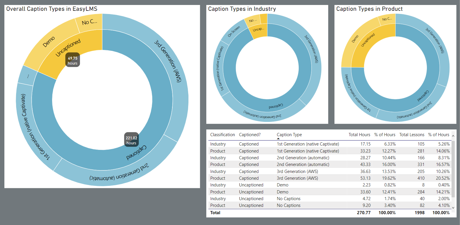
This dashboard shows three stacked pie charts and a table. The first pie chart shows the total content broken into uncaptioned and three different generations of captioned content. We had 49.75 hours of uncaptioned content, and 221.02 hours of captioned content. This content was further broken down into Industry and Product content. The bulk of the captioned lessons were in Industry. The table provided additional statistics, including the total hours, percent of total hours, total lessons, and percent of hours for the various captioning generations as well as for uncaptioned content.
This dashboard shows how many hours of closed captioning was available across our content. Due to process improvements, we had three different generations of closed captioning processes running concurrently.
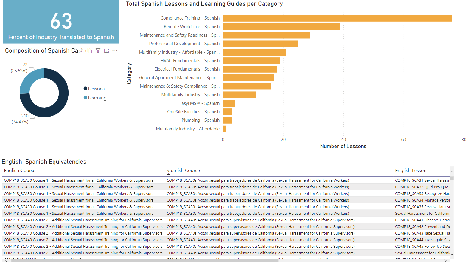
This dashboard features a text box showing the percent of Industry content translated to Spanish (63%) and a pie chart showing the breakdown between Spanish lessons (aka Captivate modules) and visual aids (aka Learning Guides). 25.53% of the Spanish content is in Learning Guides, the remaining 74.47% is in lessons. The dashboard also has a bar chart showing what subcategories of our Industry content had the highest percent of translations. Compliance training lead the pack at 80%, while Multifamily Industry - Affordable ranked last at about 3%. The bottom half of the dashboard is a table showing the English course, the Spanish equivalent, and the various English and Spanish lessons within the courses.
This Power BI dashboard provided information on our Spanish equivalent content.
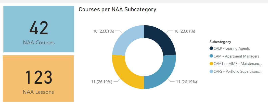
This dashboard shows we had 42 NAA courses with a total of 123 lessons. The content spanned four subcategories, each with roughly a 25% share.
This simple Power BI infographic shows the number and percent of lessons (Captivate learning objects) that comprised out National Apartment Association content.